Sunday, September 20, 2009

Project 1.2 [Reading the Sign]


Problem Statement:
Introduction of Text
You have a variety of examples of classifed advertisements (for sale, help wanted, personals, etc) for class today. You are looking for ads which are interesting and/or compelling to you at some level-ads about which you feel you have something to say. As you narrow your selection of ads, revisit your solutions from the line art exercise and make your final selection about the classified ad which you wil select by using one of the two finished 10x10 compositions as a point of reference. Can or does one inform the other in some way, direct or indirect? Assuming that the decisions leading to your line art compositions were not arbitrary, can you build on or redirect the "message" implied in the composition through the introduction of a text?
You will complete two 10x10 panels, mounted as described below. The left-hand panel will contain the original line art composition with the classified text placed within the compositional space exactly as it appears in the ad (you will be assigned a specific typeface to use for this purpose). You may enlarge or reduce the text block with respect to the image space, but al bolds, itals, misspelled words, etc. must appear as they appear in the original text. The right-hand panel will contain text ony, and will be evidence of your effort to, in some way, recontextualize the message in the classified to which you are responding. You will achieve this by essentially deconstructing the text into its component parts or phenomes (letters, words, groups of words) and reconstructing them on the page using scale, weight, and position to craft a new message which is sympathetic to both your interpretation of the text and your "reading" of the original 10x10 lineart composition.

PS My images are not uploaded yet because I am still unsure about how to do it. Someone is going to help me soon.


Tuesday, September 8, 2009

.Book/Body.


I stumbled across this article out of an archive written in June of this year relating book and the body and found it to be very interesting, so I wanted to share it. The pictures are what first caught my eye. Then I read part of the article and it took me deeper. Here is a portion. Enjoy =)


"Anne Frances Wysocki already created the webtext or new media piece A Bookling Monument in 2002. Still, it amazed me. The manner in which Wysocki tries to grapple the similarities between the way we view and envision the body and the book, combining this with a visual presentation of her text (which is an exploration of the senses itself) suits the context, the subject and the transitional process she is concurrently describing, perfectly. I also love the way she writes in a ‘tasting’ way, trying to grasp ideas, juxtaposing them with others, sometimes only putting some quotes next to one another, almost trying to create a virtual discussions between the texts she reflects upon and her own thoughts. And I like the way she asks questions way more than she gives statements or conclusions. Her text is like thinking in or as a process and the conclusions she reaches are mere reflections on this process, very insightful reflections that is.

Wysocki combines the idea or the philosophy of thinking about the body and body politics to the way we handle on, interact with and think about (the materiality of) books. Where the book is a carrier of or for words, the body is also a carrier, it can be seen as a place where meaning and context is inscribed in or subscribed too. Politics are inscribed upon the body. Wysocki compares the thoughts of Don Idhe, who states that there are two bodies (or ‘twinned senses’ of our body), the existential body as a precondition and the second body on which meaning is written, with those of Judith Butler, who argues that body and politics are one, for language or discourse already inscribe their materiality on the body, making it impossible to separate the two. Discourse is here seen as a process: our bodies are formed and inscribed upon in the process of discourse, it is not an object but something in flux, in continual transition. Wysocki quotes Butler saying that ‘discourse is a constitutive condition for matter’. Wysocki then uses their (Idhe’s and Butler’s) positions to reflect upon the book:

Wysocki argues that our technologies and representations are networked, not falling into the trap of technological determinism for which McLuhan is well known, but for the mutual influence of both on each other. For her there is no causal relationship. She compares “the medium” with the body, inside and outside, the words, the text as the inside, the book as the body, the exteriority."

“The book – pages contained within a cover – is thus a metonym for a particular sense of self: there is the visibly fleshed body containing (and so shaping) the thoughtful interiority visibly fixed within.”

Project 1. Comp 3.


Project 1: Final Composition.
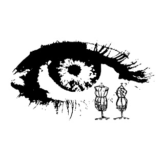
Designer's Eye
Mannequins. I chose this image because I found it to be somewhat intriguing and eye-catching. they look old-fashioned instead of modern, as if each could tell a life's story. But what are they anyway? What was their soul purpose? At first they were used as artists jointed models. They have also been used for CPR training, first aid, and intubation. But now they are known as life-size dummies who wear clothes to display fashions.
Then we have the second image: the eye. I loved this image due to the fact that it looks so imaginative and real. Our eyes see our life, friends, family, bad times, good times, mistakes, and our accomplishments. Not only do our eyes see our personal life experiences, but they also notice the world around us such as buildings, nature, advertisements, other people, road signs, and so much more. It allows us to enjoy the world visually and erratically, but wach person can decide exactly how they use their sight. Athletes use them to play their sport, scientists use them to analyze data, doctors use them to save lives, and designers use them to well, design.
Together these images portray the designer's eye, I thought. Designer's see the world in a whole different light and have too to visually get their point across. They see the outside world and either think beauty or change. The mannequins can also make these images relate to the media and advertising to the public. Everyone wants the "in" style and the most popular piece in the market. It's common fact. Our eyes visualize what we want and our brains say go get it. Once we attain that certain piece of clothing, video game, or shoe we feel at ease or satisfied. Advertisement and the media do that to us. It's like a drug.